Basics of Print Media
When implementing a print media campaign, there are quite a few things to remember to ensure maximum quality is achieved with your final product.
When hiring a professional design firm or a designer to execute your print campaign, you should make sure they are aware and comfortable with the information in this article.
We’ll explain some of the basics you should be aware of regarding printed media so that you can make sure you are hiring the right group of people (or person) to handle your campaign.
Understanding Color Profiles
Color profiles are extremely important in printing. Your document(s) should be set up in what is known as a CMYK color profile. Under no circumstance should your print campaign contain objects compiled in an RGB color profile.
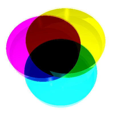 CMYK is a printing process, also know as 4 color printing, which utilizes Cyan, Magenta, Yellow, and Key (or, Black). There is a lot of detailed information regarding why CMYK is a more efficient means of printing, but that is not something we will delve into at this time.
However, understand that CMYK is for printing, while RGB is for use on the web.
Spot color printing is also appropriate (such as using Pantone colors), and is mostly used for ensuring color matching on printed objects such as logos. But be aware that spot color printing is fairly pricey, but because of its extremely accurate nature, is an excellent choice when you absolutely need a particular color to be reproduced.
Bleed, Trim, and Safe Area
Next, it is important to understand these 3 terms.
Bleed
If you want elements in your document to reach all the way to the edges when in final printed form, you’ll need to make sure what’s known as a “bleed” is included. The more space you can provide, the better, but most printers require at least 1/8″ of bleed (and preferably more).

Trim
Next, you’ll need to make sure that you identify the trim area of your document. The trim area should be set to what your final document size will be. In the image above, you’ll notice the trim is identified by the magenta rectangle.
Copy Safe Area
Finally, the Copy Safe Area is basically the “boundary” for any text or important information that you want to make sure is printed clearly. This is imperative, because many printers have a slight variance in where the trim of your document occurs. The typical practice is to place your copy safe area at least 1/8″ of an inch from your trim line. This makes sure that if the printer has any variance in their trim, you don’t lose any vital information from your document.
Resolution
This is very important bit of information, and actually, a fairly common mistake that printers run into. Images that are often pulled from the web are not suitable for print, unless they are specifically made to be high resolution. Often, it is easy to tell the difference between a high resolution image and a low resolution image by file size alone. However, that is not the only way of identifying resolution. It is important that, when printing, your imagery and photography has a resolution of at least 300 DPI (dots per inch). Otherwise, the image may reproduce blurry and pixelated.
Remember, with photography and other forms of images used in printed media… bigger is always better.
Rich Black
This example shows what you might be looking at on your screen with regular 100% Black and what’s known as a “Rich Black.”

However, the image below shows how the above actually prints, by comparing regular 100% Black (left) and a Rich Black (right).

So what’s the difference?
When designing on a desktop publishing program, such as InDesign or Illustrator, the default black value is set as Cyan 0%, Magenta 0%, Yellow 0%, and Key (Black) 100%. However, if you print using these CMYK values, your printed media will be produced with a very washed-out black.
How to avoid washed-out blacks
By using what is known as a “Rich Black.” This is achieved by setting the CMYK values to C40% M40% Y20% K100% or C60% M60% Y40% K100%.
This will produce a full-color black that is vibrant and really jumps off the page.
Just keep in mind, this can only be done when producing media that is using 4 color printing and does not apply to grayscale printing.
Dealing with Fonts
When sending artwork to printers, it is important to remember that one of the most common compatibility issues is that of missing fonts.
There are two methods to avoid this issue… either packaging your document or outlining the fonts.
Packaging Your Files
If you are working in a page-layout publishing program such as Adobe InDesign, you have the option of “packaging” your files. Basically, this takes any and all images and fonts that are you used in your document and creates one nice, tidy folder where they all reside.
This image shows how the packaged folder is structured.

This is advantageous because you can then provide the folder to your printer as-is, and they can open your file (as long as they have compatible software) just as you created it… fonts and all.
Outlining Fonts
Another option when supplying files to the printer is to do what is simply known as outlining the fonts. This is especially useful for documents such as Adobe Illustrator files.
When outlining the fonts (also referred to as outlining the type), the publishing software simply creates vector shapes of the characters in the words… so they actually end up becoming separate shapes, instead of editable type. This ensures the printer can view the document as-is, with no type compatibility errors or issues.
The Bottom Line
Hopefully this information helps you as you execute your print campaigns. When working with a design firm or a freelance designer, it’s extremely important that they are able to comfortably work within the industry printing standards such as these. Making sure you are working with the right industry professionals is key when producing high-quality branding campaigns.